EHealth Medicare.com
Design & Brand Strategy
Creative Direction, Branding, UI Design
Background
eHealth was looking to incorporate it’s existing brand values into a refresh of it’s primary shopping flow.
With a short timeline and limited access to users and stakeholders, we wanted to capture the spirit and personality of eHealth’s call centers and create an online experience that reflected the experience customers received in the call center.
My Role
My role in this project was Design Lead.
I partnered with the Design Director and product leadership team to establish a new brand direction for the team to use to redesign of our current customer facing shopping experience.
The Problem
eHealth had a pre-existing brand identity that had not stood the test of time. We wanted to create an identity that was Reliable and Trustworthy, but also more Warm, Helpful, and Human like the call center experience.
Brand Audit
We kicked off the project by gathering an overview of the existing brand assets to get an idea of what we were working with.
eHealth’s previous visual indentity
Mood Boards
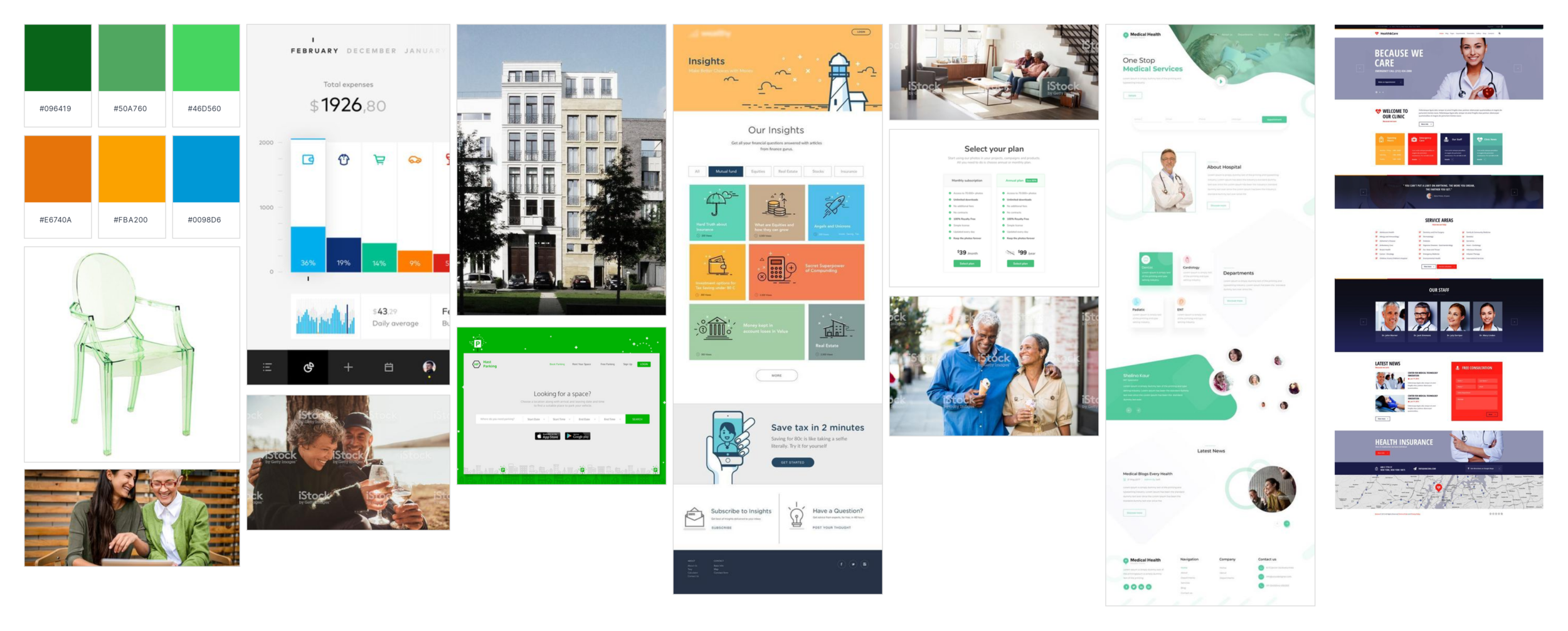
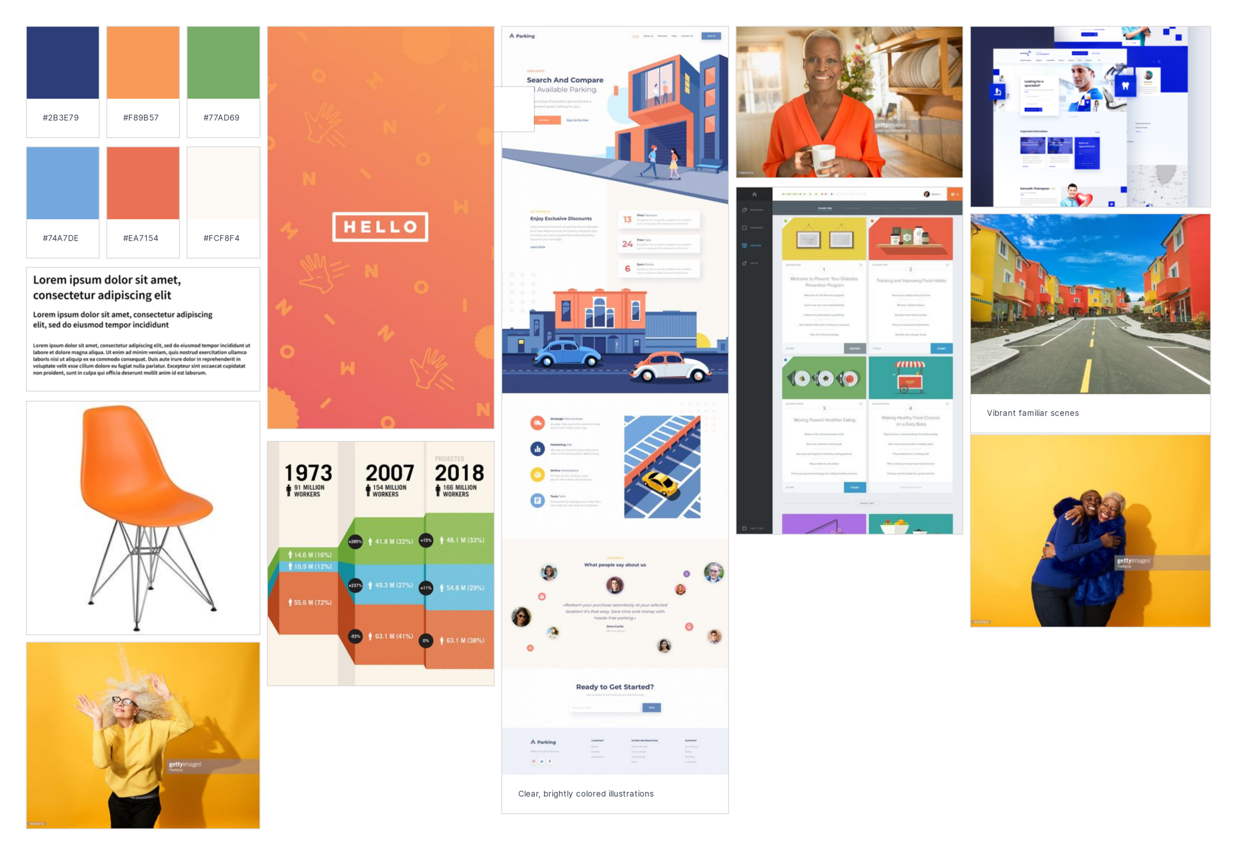
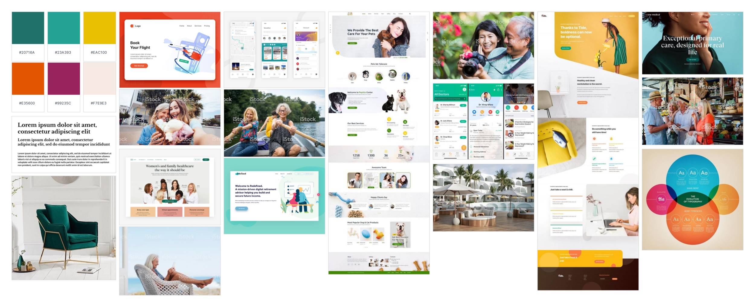
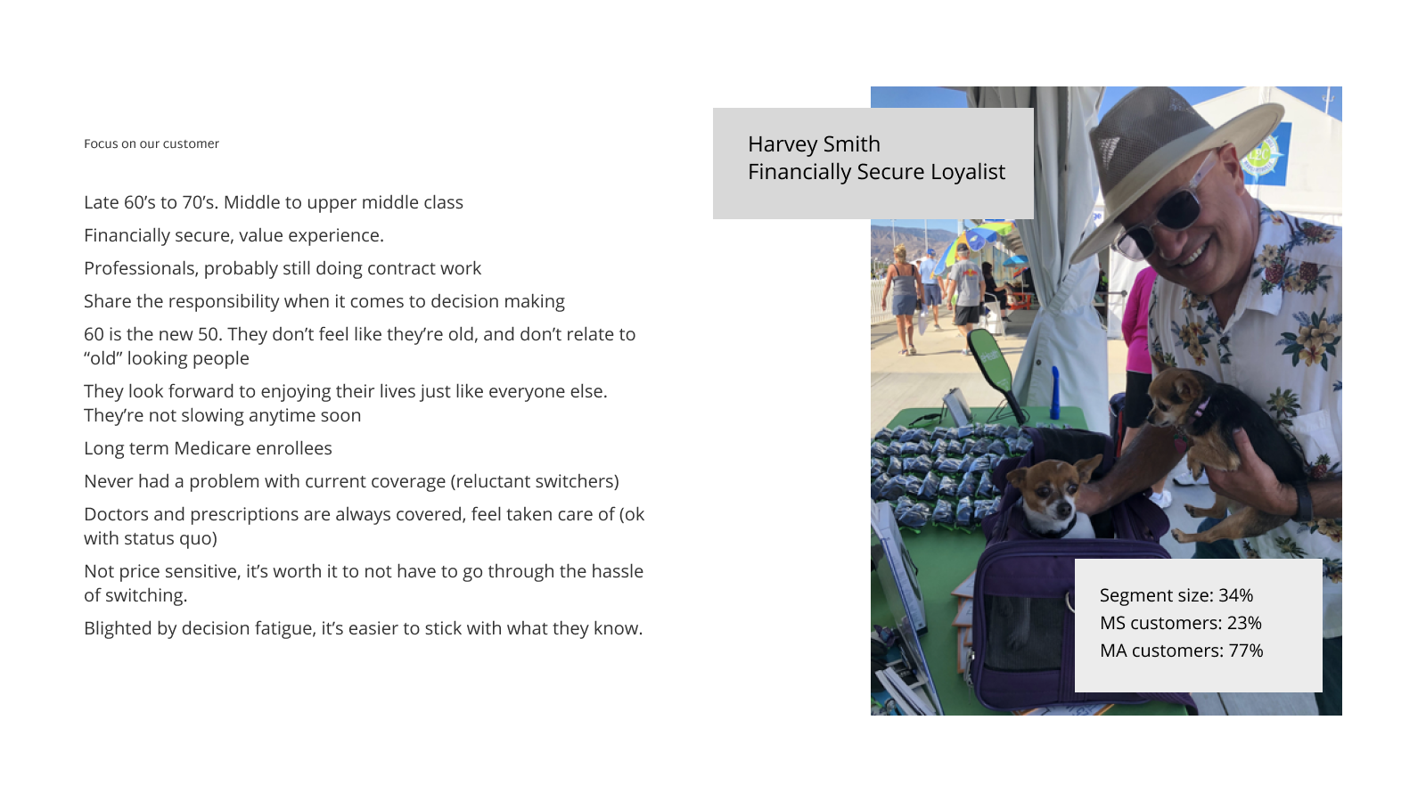
I created three visual mood boards based on the company values, my customer knowledge, and a review of what was going on in the industry. I then presented these mood boards to our primary stakeholders (product leadership) to get buy in on which direction they felt represented the vision of the business and the way that eHealth wanted to be seen by our customers.
Concept Refinement
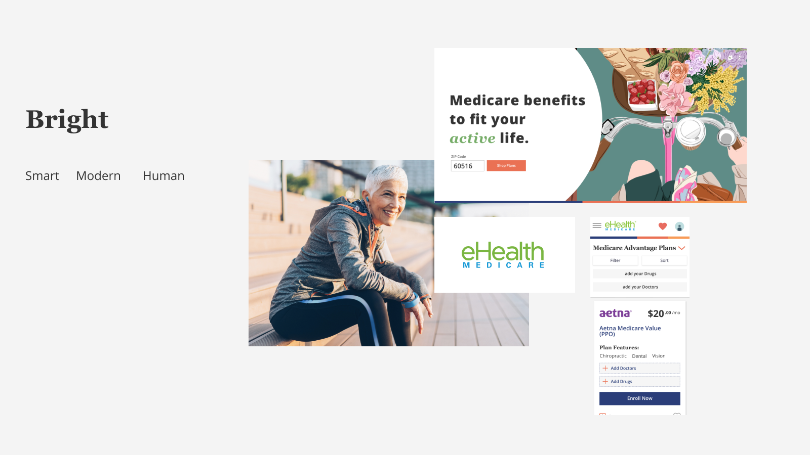
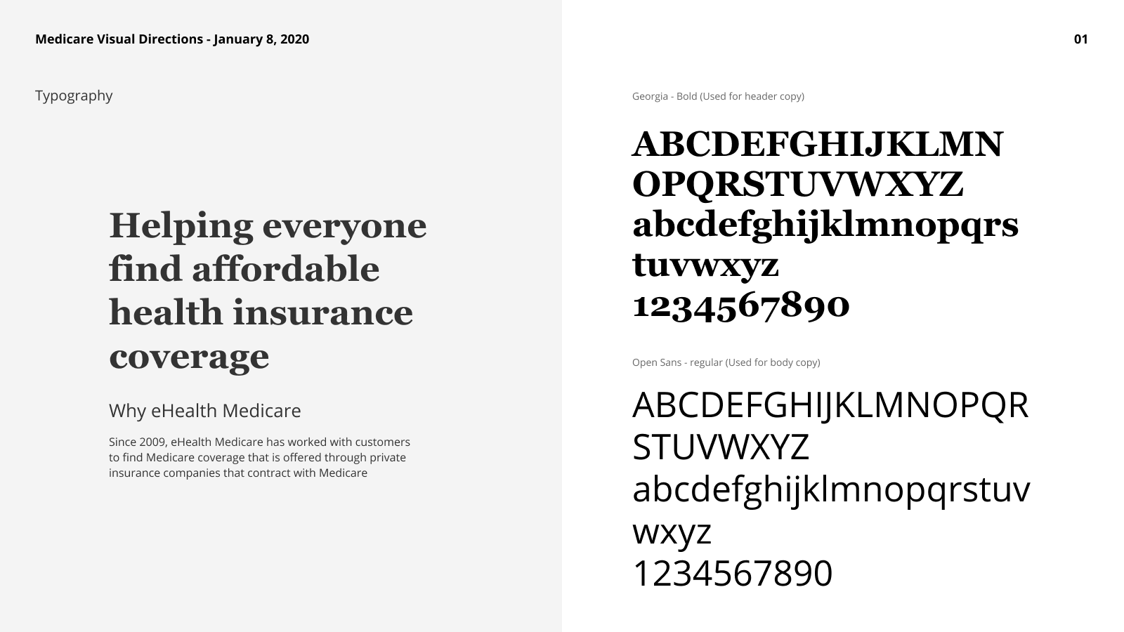
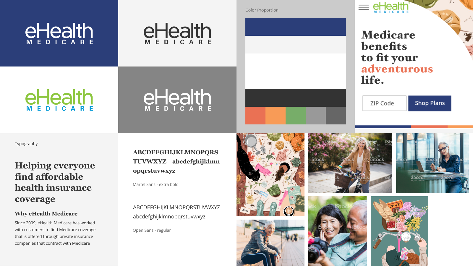
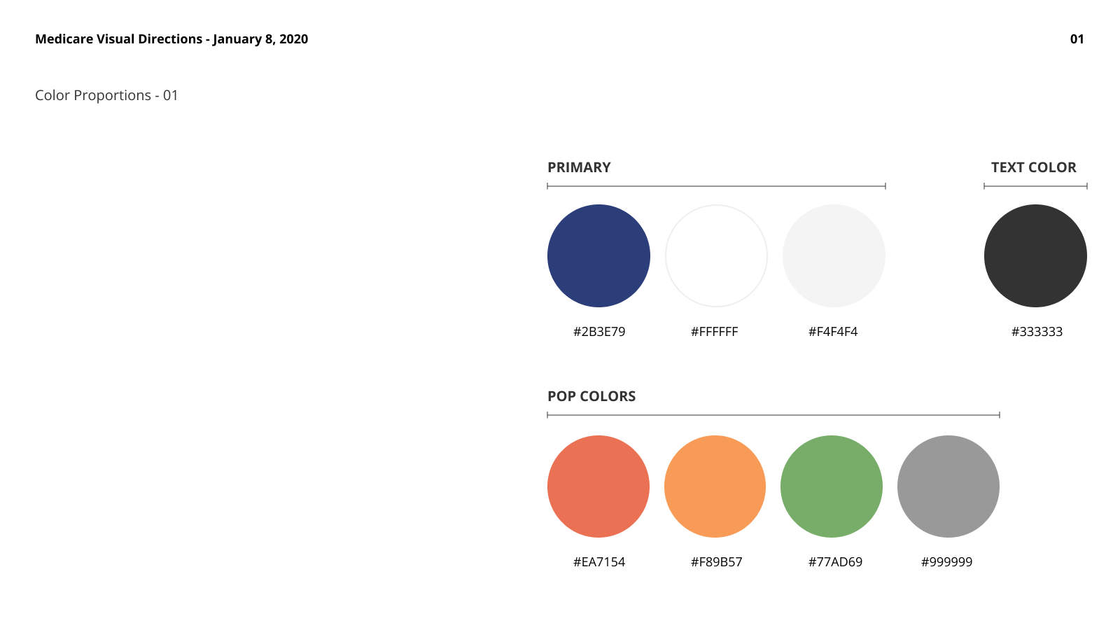
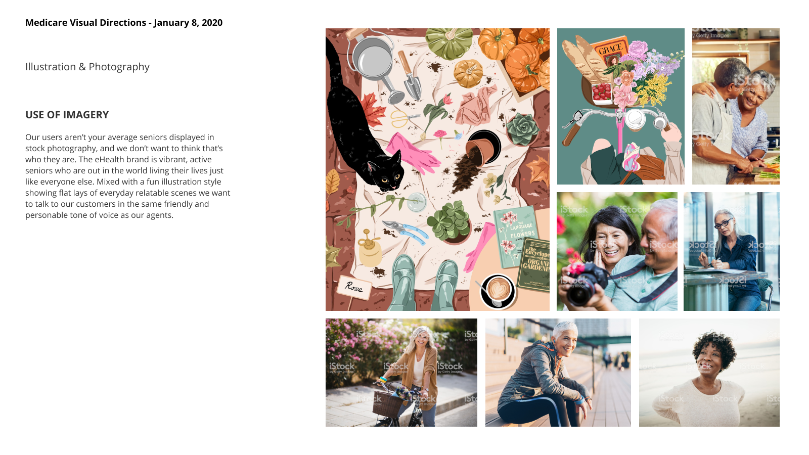
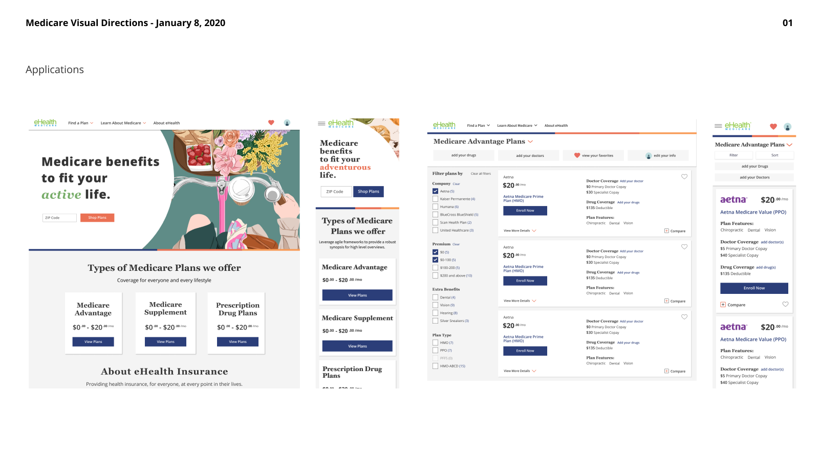
After choosing a visual direction I conducted several rounds of design review including a deep dive into some of the primary pages of the shopping flow, exploring fonts, color palettes, illustration and interface design. These were presented to a group of stakeholders alongside another direction created concurrently.
Outcomes
While in the end we went in a more corporate blue direction, although aspects of my direction were incorporated into the final designs including explorations in using more “friendly” colors. This was a great opportunity to explore the brand and what it could be in the future.

