
Plan Recommendation
Employing machine learning to help our agents find a plan that fit our Customer’s needs
Product Design, User Research
Overview
We had developed a machine learning recommendation engine and user interface to help agents pick a plan for our customers more efficiently based on information we had collected during our sales calls.
From the data gathered, we had built confidence that our recommendation engine works (it led to a decrease in churn and more customer satisfaction) but we found our agents weren’t always picking the top recommended plan.
Role
I led design partnered with a Product Manager, Data Science, and the sales operation team.
The Problem
Agents were infrequently selecting the top recommended plan.
Due to the customer benefits of selecting a top recommend plan, we wanted to influence our agents to select the top recommended plan, and if they didn’t select the top recommended plan we wanted to understand more on why they didn’t.
Our hypothesis were:
Agents were losing the top recommend plans in the sort order- through user observations we realized that when the agent clicked on certain filters the top plans would become lost in a list that could be as long as 50 plans, therefore they were out of sight, out of mind
Agents didn’t realize why the top plan was better than the plan they had selected, or were simply selling based on other customer’s satisfaction with their plan and we wanted to surface those reasons in a more compelling way.
As a team we brainstormed and came up with the idea of “pinning” plans whenever an agent selected a filter that removed the plans from the top level of the sort order. After discussing with product management, I sketched out a couple ideas:

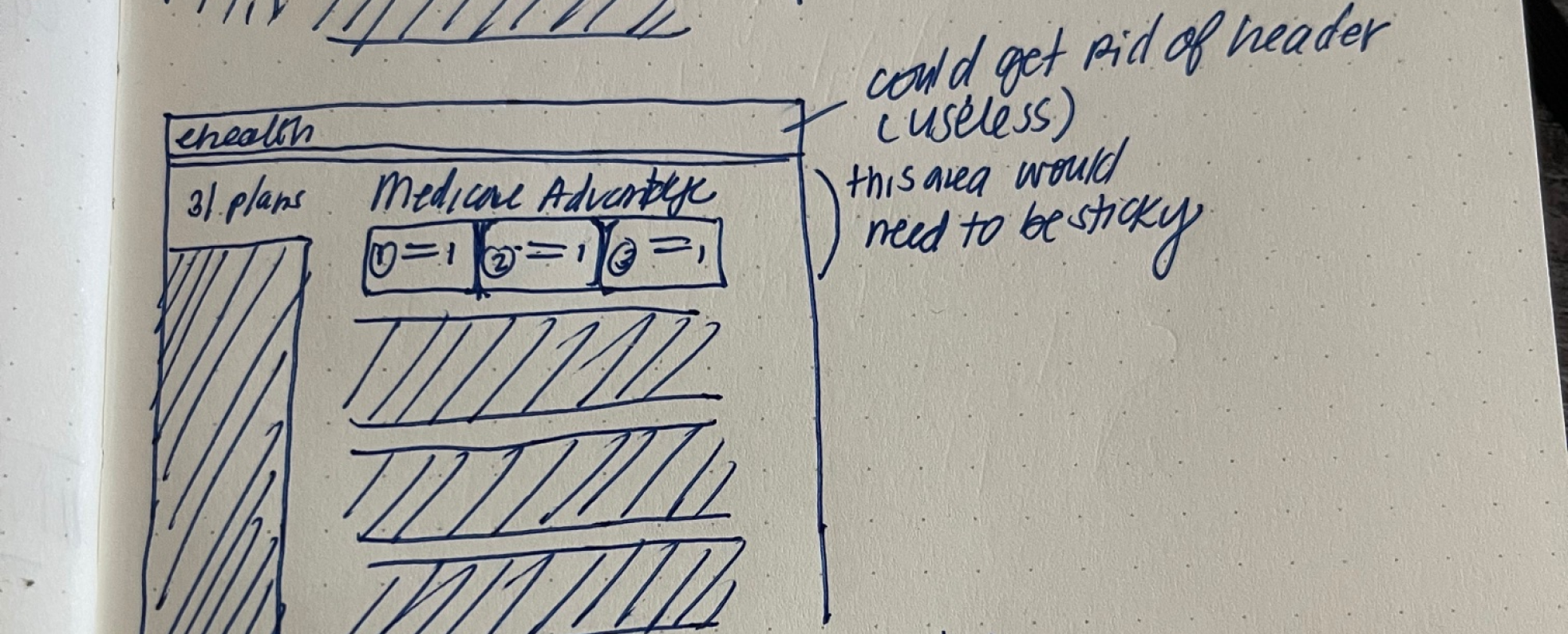
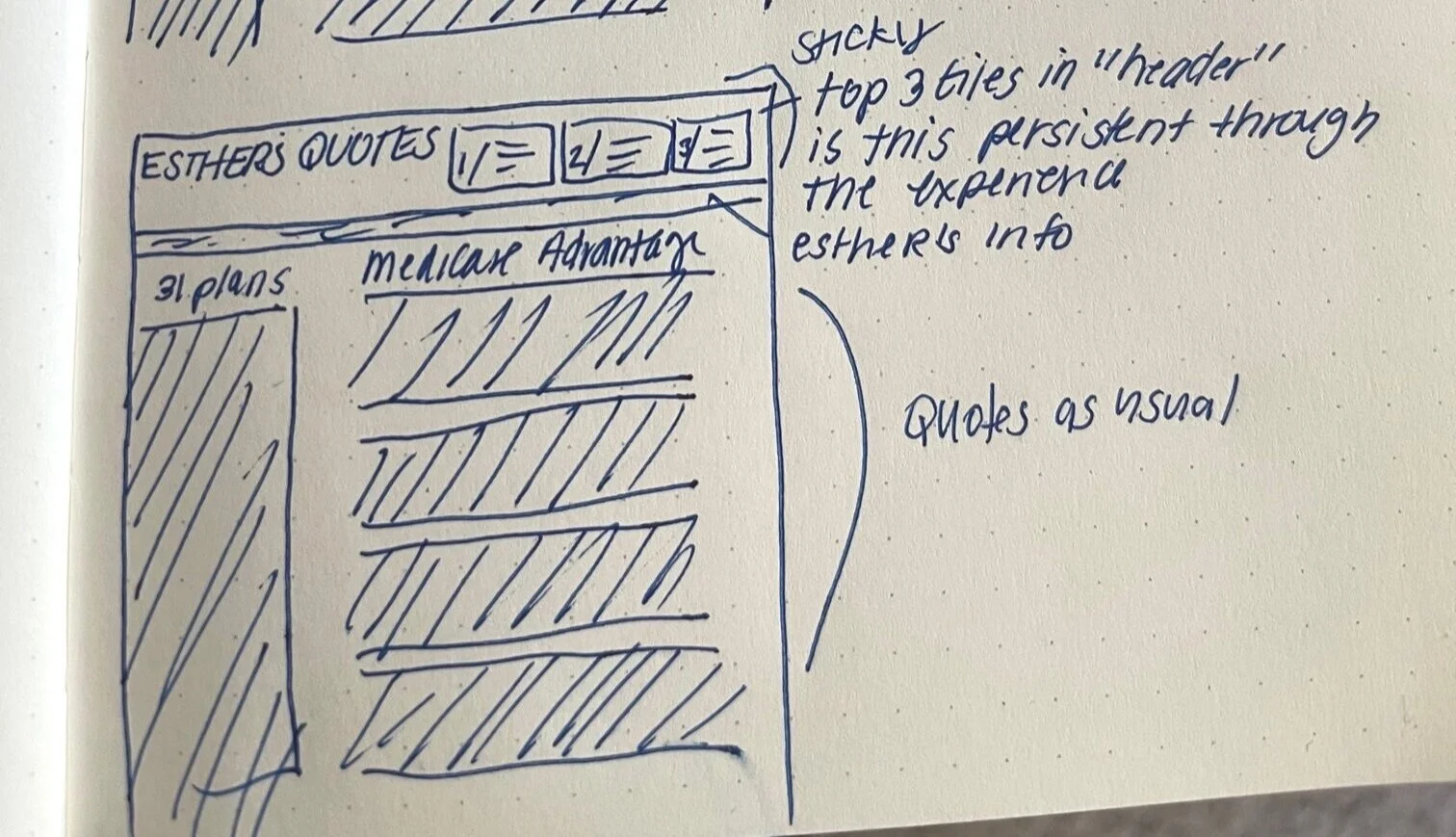
I then moved into a higher fidelity Figma design to present and get feedback from Product.
The review was focused on location and content. We decided as a team to go with “Option 2” since it met our desire for a more prominent solution. We also wanted to show more details than currently in the mock and consulted with our partners in sales ops to determine what those might be.


User Testing
To get additional feedback, on content, as well as on the interface itself we decided to conduct some user testing. As luck would have it, our User Researcher was occupied with other projects. After some noodling, I managed to come up with a way to gather feedback using a combination of a survey monkey survey and a Figma prototype.
Survey Brief:
We conducted a self guided user testing using a survey monkey survey and invision prototype gathering feedback over the course of a week to allow agents time to complete the survey.
We utilized our Agent Advisors- a group of sales agents from all locations/experience levels we had recruited to solicit feedback from since this was more general research


The Findings
When asked what experience agents preferred agents preferred experience 2, although not dramatically (this was not surprising)
They liked being able to compare all three plans at once
They thought it was easier to see the details in experience 2
“Simplified easy to read information without seeing too much. It provides high level information that is typically important to beneficiaries when selecting the right plan
User 7
Our decision was to move forward with option 2.
When asked what information agents wanted to see for the plan highlights, our research confirmed that our gut was spot on with the information we had included in the mocks. We had additional feedback that agents wanted to understand how plan recommendation works, which we shared with our partners in training since that appeared to be something they could train to vs. trying to create an interface to do so (we had tried this in the past and found the “reasons” hard to communicate clearly).
We decided to move forward with the features we had and worked with sales training to further educate our agents on the recommendation tool.
Additions
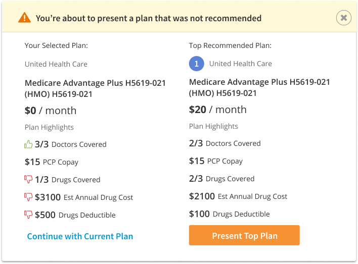
After our user research, we also wanted to encourage agents to select the top plan and if they didn’t gather the reason they didn’t. As much as they wanted to understand the recommendation engine we wanted to understand their logic as well.
We decided to add an additional modal that would appear when the agent did not select a top plan. I put together some options on how we could visually differentiate the plans highlight features that were either better or worse than the top recommended plan to help guide the agent’s choice.


We reviewed internally and decided we wanted to show was was better/worse in only the plan that was not recommended.
What we launched


What we learned
We launched the experience to 50% of our agents to get feedback before rolling it out to the entire sales floor.
After launch we saw a better selection of the top plan in the experience, and the top rank plans in the experience have a higher CVR
Lower conversion rate for the experience likely due to the friction introduced
And we learned that we had some improvements we could make to the plan recommendation model itself, including more flexibility for customer preferences (carrier, plan type, etc), other benefits we had not included in the model, and how we manage certain plan types.